Orbit
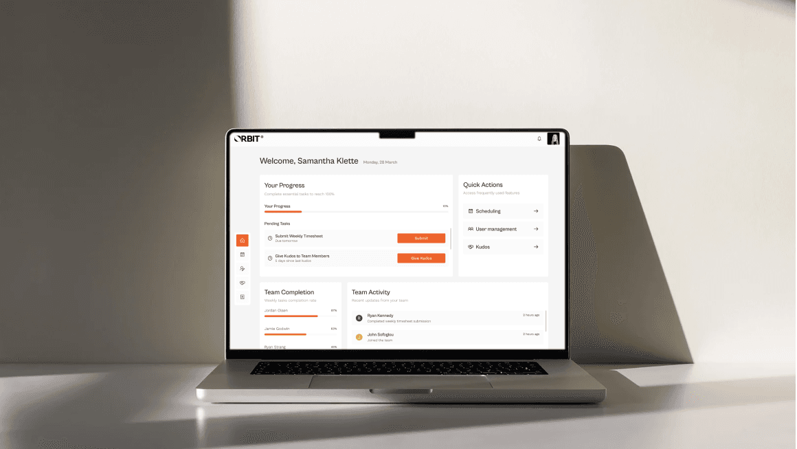
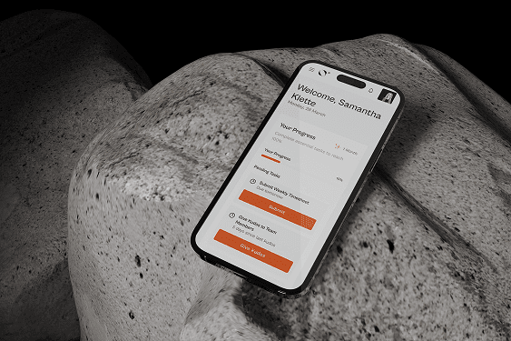
A centralised operations platform that keeps teams aligned on projects, files, and progress, with peer recognition built into the same workflow instead of bolted on as a separate app.
The problem
Most internal dashboards are cluttered, slow, and confusing. Users struggle to find what they need or take action quickly, and the teams I interviewed (project leads and creative leads working across departments) felt it directly: people wasted time jumping between apps, files got lost in scattered systems, and there was no single place to plan, manage, and track work. Orbit needed to be intuitive from day one, not another tool competing for attention.
The goal
A clean, all-in-one platform where teams can manage projects, share files, and stay aligned from start to finish.
User research
I interviewed project leads and creative teams working across multiple departments, aiming to understand their pain points, workflows, and what slows them down day to day. I also used AI tools early on to help synthesise interview notes into clear patterns faster, freeing up more time for the interviews themselves.
People waste time jumping between apps.
Confusion grows when files are lost or scattered.
Teams want one place to plan, manage, and track everything.
User insights
“Sometimes we don't even know where the latest file lives.”
“Too many apps create silos. We need one space for everything.”
“Project updates fall through the cracks because of disjointed systems.”
Persona
Liam · Project Manager
Wants a clear overview of timelines, progress, and team responsibilities.
Amara · Creative Lead
Needs fast access to shared assets and a system that helps her team stay on track.
Journey map
I mapped the full user journey from planning to project handoff to spot pain points and areas for improvement, designing features that support users at every step and reduce friction across teams.
Planning
Disjointed tools, inconsistent formats.
Frustrated
Combine planning and assets in one space.
File sharing
Shared drives and emails.
Anxious
Keep all files stored, searchable, and versioned.
Collaboration
Comments lost in chat threads.
Confused
Centralise communication.
Feedback
Feedback is hard to organise.
Overwhelmed
Structure feedback in context.
Handoff
Files are not always version-controlled.
Rushed
Make delivery seamless and documented.
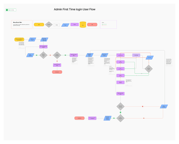
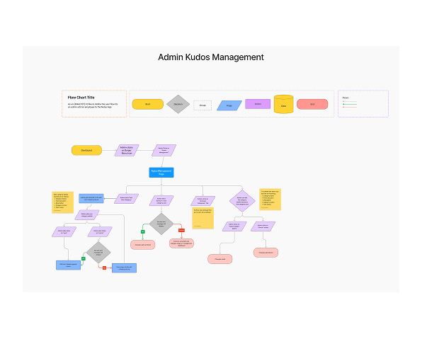
I mapped each flow end to end before any screen was designed, using AI to help draft and stress-test flow and requirement variations before refining them by hand. That meant every decision point, branch, and edge case got caught on a flowchart, not in a working prototype.
Wireframes
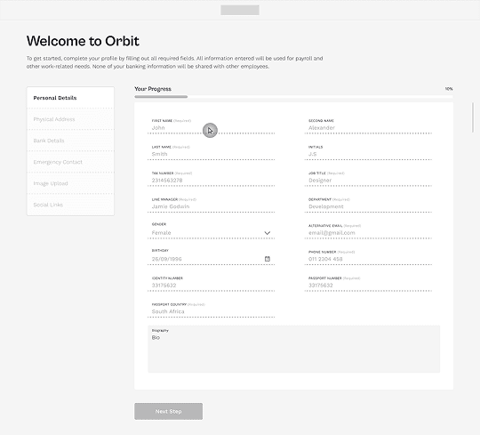
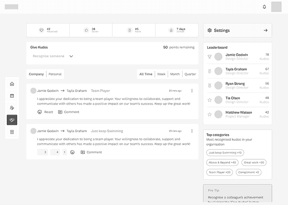
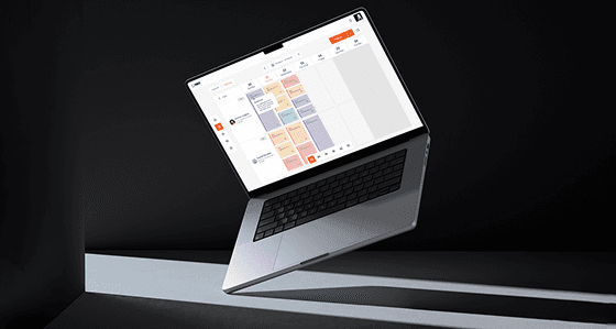
Once flows and requirements were mapped, I created high-fidelity wireframes to visualise structure, layout, and functionality before applying the final visual design. These wireframes helped test usability early and align stakeholders on layout decisions.
Component library
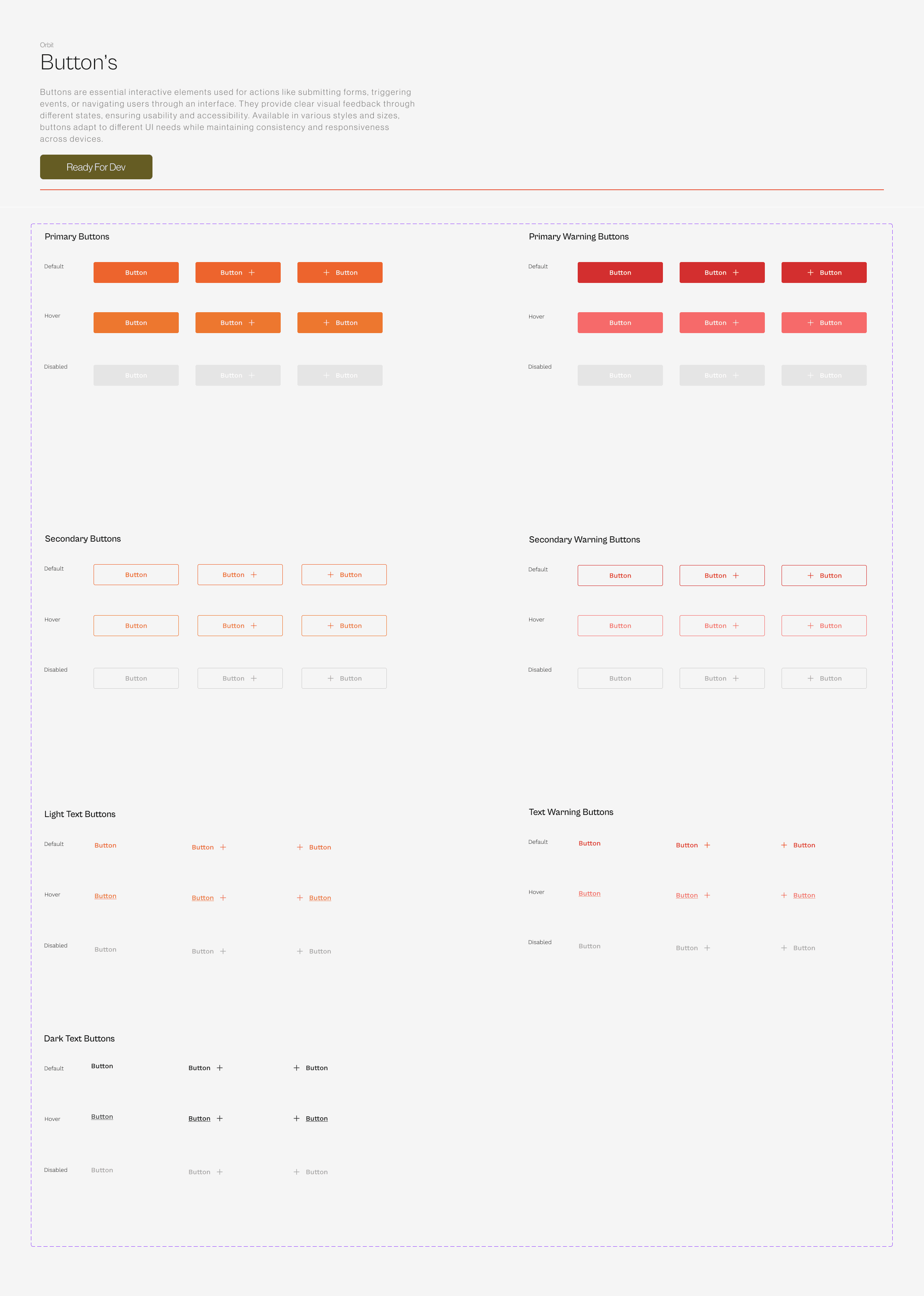
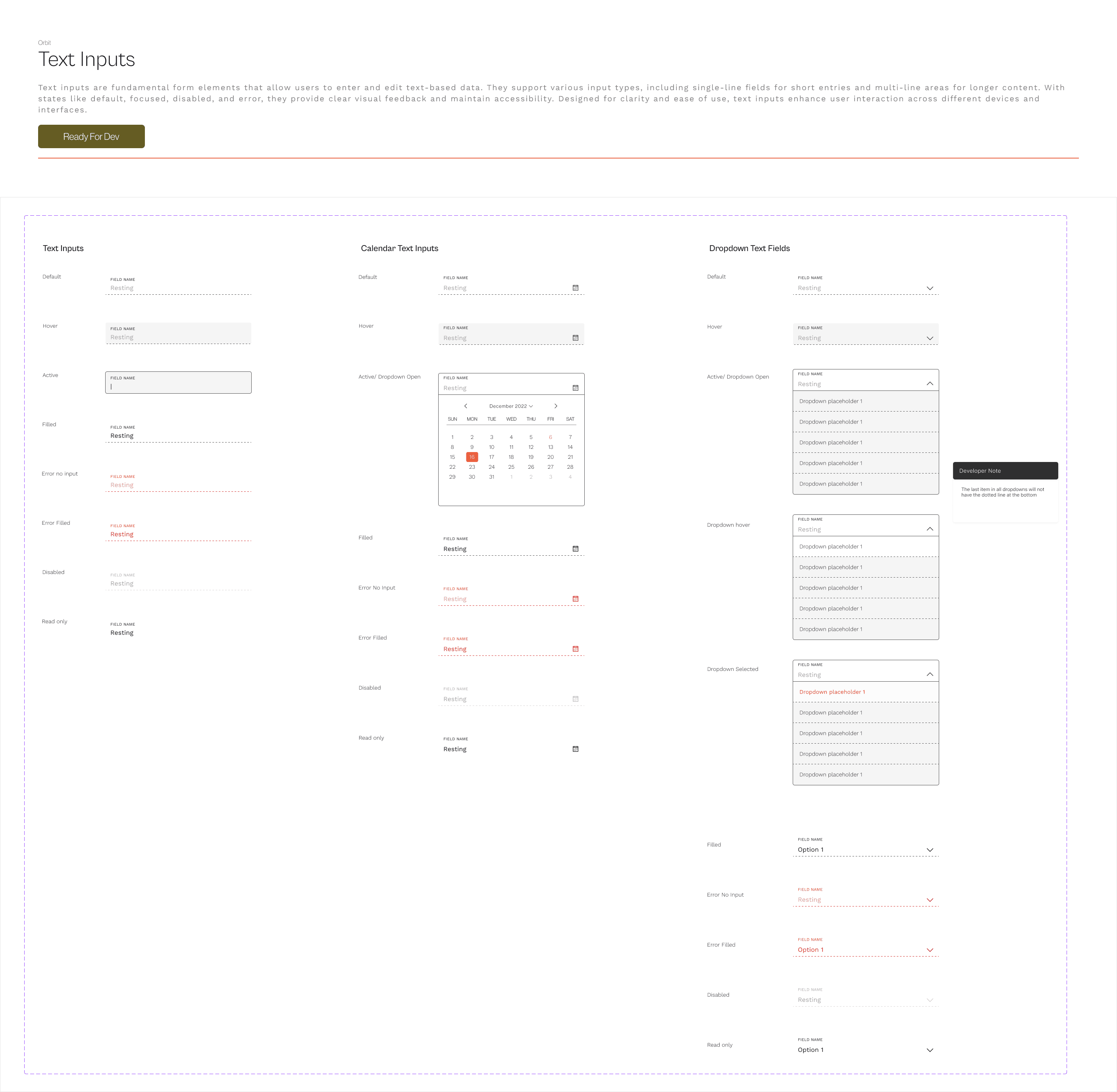
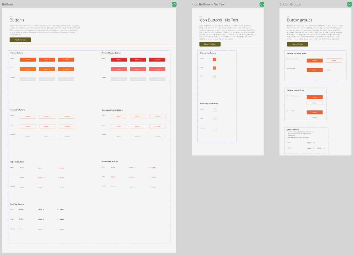
Wireframes fed into a proper component library, not a one-off screen file: buttons, inputs, dropdowns, and form patterns built as reusable sets with every state (default, hover, active, disabled, error) defined once and reused everywhere, each one marked Ready For Dev with handoff notes for anything a developer could otherwise misread.

Key decisions
Grounded the platform in two distinct personas, not one generic "user"
Research surfaced a Project Manager who needed a clear overview of timelines and team responsibilities, and a Creative Lead who needed fast access to shared assets, different enough that the journey map (Planning → File Sharing → Collaboration → Feedback → Handoff) had to work for both roles, not just the loudest one.
Built recognition into the workflow instead of bolting it on
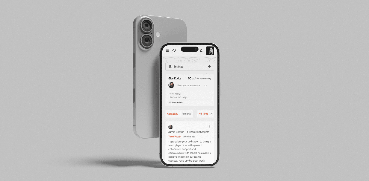
Rather than treating peer recognition as a separate 'kudos' app, it lives inside the same platform teams already use for tracking work: a Company / Personal / All Time feed sits alongside the project and file tools, so acknowledging a teammate's contribution takes the same number of clicks as checking a deadline.
Style guide
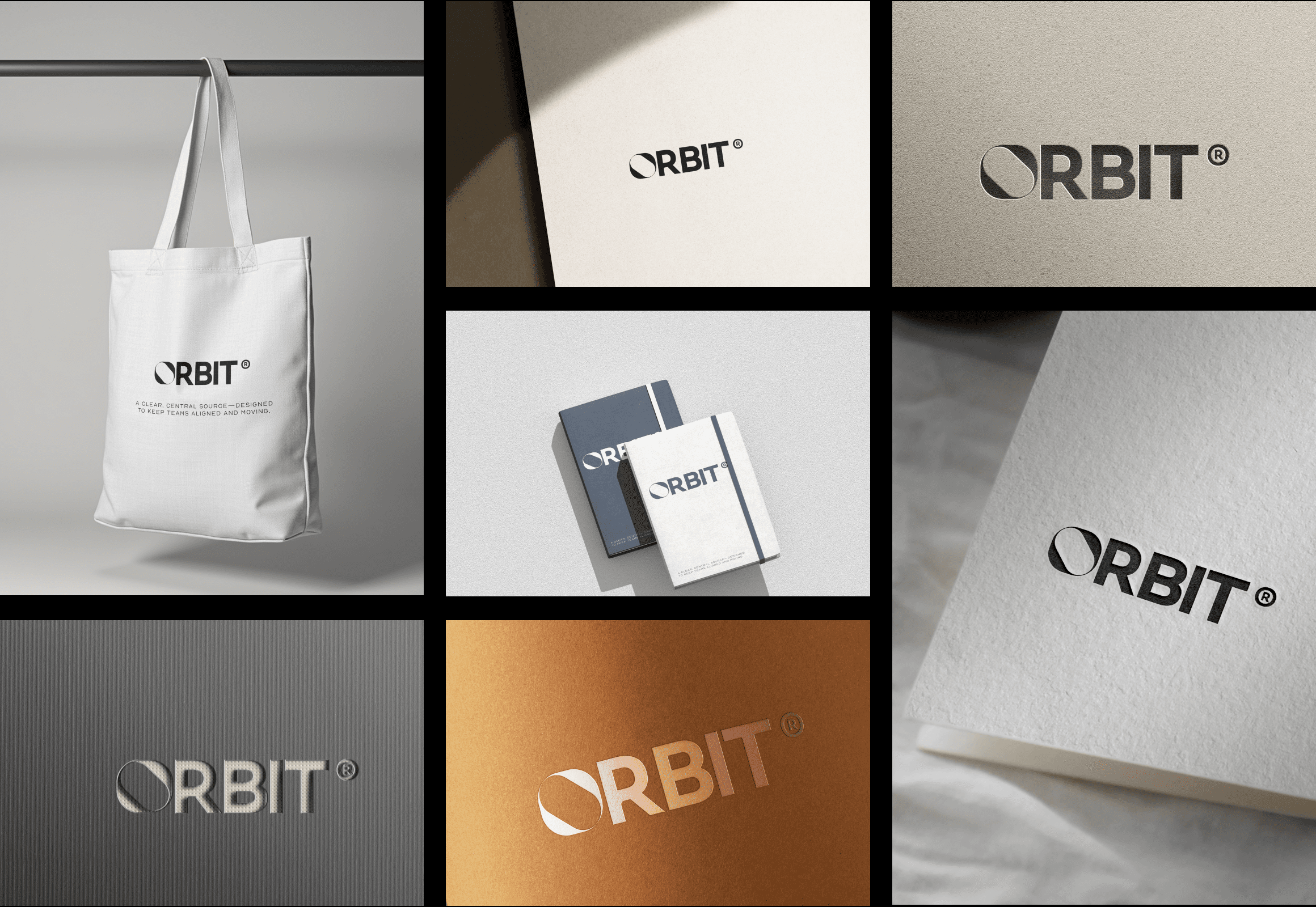
A circular mark suggesting orbit paths: focused and connected.
Cabinet Grotesk for headings, Work Sans for body text.
Soft monochrome with a blue accent to highlight key elements.
Focused, helpful, clear.
Cabinet Grotesk
ABCDEFGHIJKLMNOPQRSTUVWX
abcdefghijklmnopqrstuvwxyz
Work Sans
ABCDEFGHIJKLMNOPQRSTUVWX
abcdefghijklmnopqrstuvwxyz
Where it landed
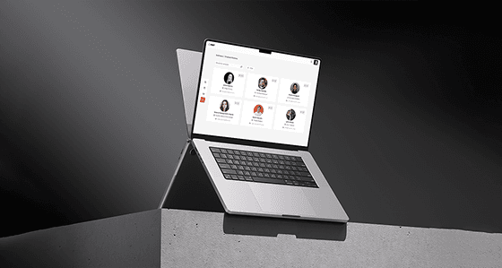
Built and running in an internal environment, ahead of a full team rollout.
What I learned
Research shapes structure: understanding how teams actually work, not how we assumed they worked, shaped the journey map and the final navigation, not just the copy.
Consistency wins: it is easy for brand and system guidelines to drift apart once real screens get built. Keeping them tight kept the final product clear and usable end to end.
Test, revise, repeat: iterating against real testing throughout, including AI-assisted testing of features before they shipped, caught major UX issues early, instead of after launch when they would have been expensive to fix.
What’s next
Real-time sync is next: exploring live updates across pages and dashboards instead of requiring a refresh to see the latest state.
More workflow tools are planned, extending functionality based on what the research already surfaced about how teams want to work.
A closed beta with internal teams comes before wider access, to validate the platform against real daily use first.