EHUB
A digital-first platform for hosting and entering sports events, built to replace WhatsApp groups and spreadsheets.
The problem
Clubs and organisers were relying on manual tools (WhatsApp groups, PDFs, spreadsheets) to run sports events, which made communication hard and the entry process fragmented for everyone involved. Research across organisers, athletes, and club managers surfaced the same pattern from every side: people were wasting hours following up manually and collecting data across disconnected platforms, with no central hub either side could trust.
The goal
Create a seamless, digital-first product that brings structure, clarity, and trust to the way sports events are hosted and entered.
User research
I interviewed event organisers, athletes, and club managers to understand what their day to day looked like when managing or entering events: how they currently manage or enter events, the biggest frustration with the current process, and what an ideal experience would look like.
Most clubs use outdated tools like email threads, spreadsheets, or DMs.
Athletes want a simple 'book and go' experience.
Organisers need better visibility of entries and payments.
There's no central hub that everyone trusts.
Persona
Josh · Club Organiser
Wants to simplify event setup, manage bookings, and track payments, without wasting hours following up manually.
Journey map
I mapped the user experience before and after Eventhub to identify gaps and build a better flow for both organisers and participants. The goal was to simplify every step, from planning and promotion to booking and payment.
Plan event
Uses the Eventhub dashboard.
Structured templates and saved presets.
Share info
One event link or QR code.
All event details in one place.
Collect entries
Centralised dashboard.
Auto-organised entries and data export.
Manage payments
Integrated payments.
Automated tracking and payouts.
Update participants
Sends bulk messages or updates via the app.
Instant delivery, confirmed reads.
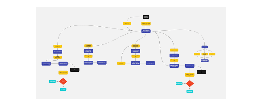
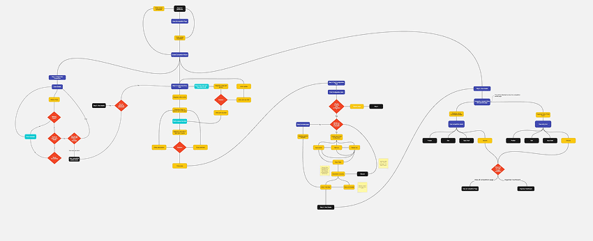
I mapped the organiser's and the athlete's flows separately before touching a single screen: how an organiser sets up a competition and its entry form, and how someone simply finds and views one. Keeping those two jobs to be done apart on paper first meant the eventual navigation could serve both properly, instead of one flow being a compromised version of the other.
Wireframes
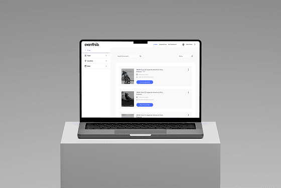
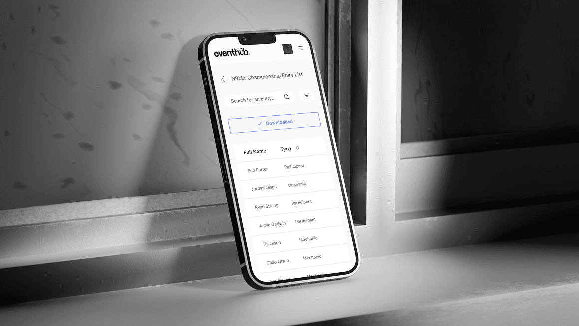
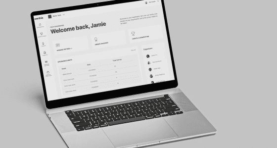
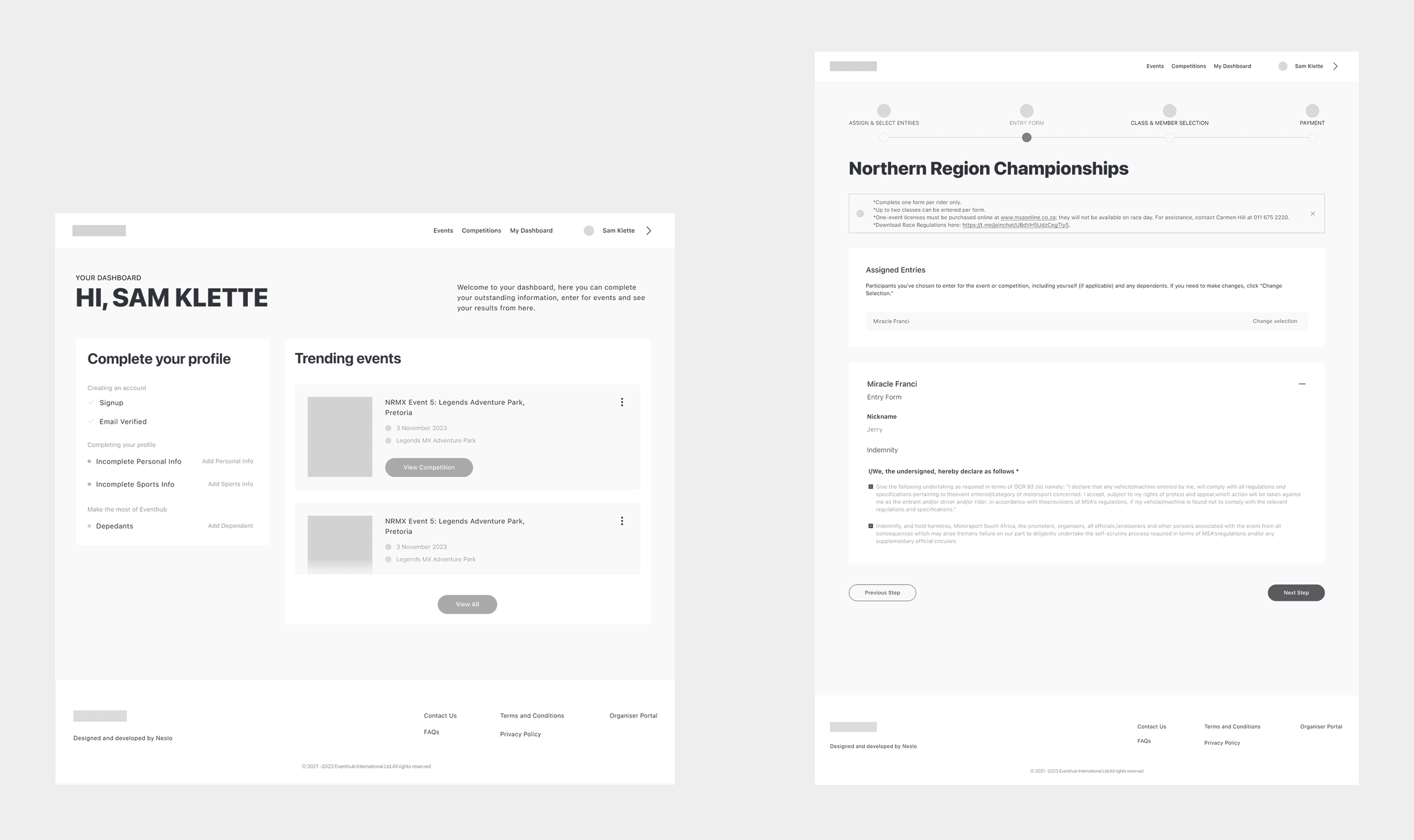
I began by mapping user flows to define the key journeys and interactions within the product, which guided the structure and logic of the experience. From there, low-fidelity wireframes shaped layout and hierarchy, then were refined into high-fidelity wireframes focused on clarity, interactions, and usability before moving into the final UI design.
Key decisions
Interviewed across every side of the transaction, not just the end user
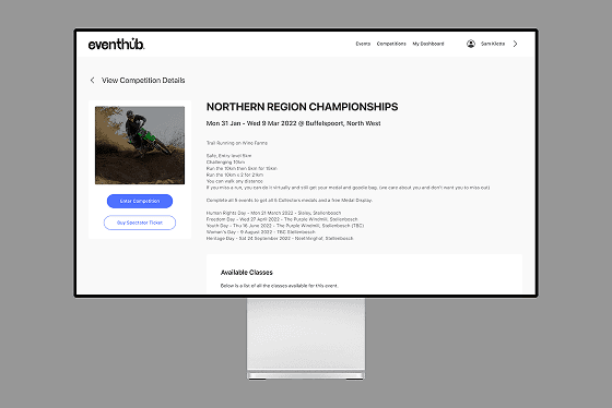
Most redesigns interview the person clicking the buttons. This one also interviewed the organisers running the event and the club managers coordinating logistics, surfacing frustrations like wasting hours following up manually and collecting data across platforms that an athlete-only research pass would have missed.
Solved the organiser's visibility problem, not just the athlete's booking flow
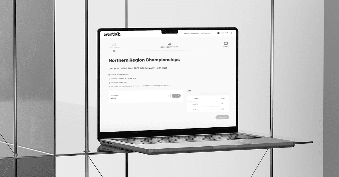
User insights showed organisers needed better visibility of entries and payments as much as athletes needed a simple 'book and go' experience. The journey map treated both as first-class flows (planning and promotion through to booking and payment) rather than designing one happy path and retrofitting the other.
Style guide
SF Pro throughout, for consistency across web and mobile.
A cool, structured navy-to-blue-grey palette, built to feel trustworthy rather than playful.


SF Pro
ABCDEFGHIJKLMNOPQRSTUVWX
abcdefghijklmnopqrstuvwxyz
Where it landed
Live in an internal environment, with rollout to clubs and organisers still ahead.
What I learned
Early interviews surfaced pain points that a survey alone would have missed: the flows were grounded in what organisers and athletes actually said, not assumptions made on their behalf.
Refining small details (microcopy, button hierarchy, entry points) made a bigger difference to the booking flow than any single big feature would have.
Testing throughout the process, not just at the end, kept the team from overbuilding features people did not actually need.
What’s next
Expanding personalisation is next: giving users more control over saved events, preferences, and reminders to increase long-term engagement.
Accessibility is a priority for the next iteration: colour contrast, font scaling, and keyboard navigation for a wider audience.
Exploring partner dashboards tailored for event organisers could open up a two-sided platform and new features down the line.