Xenith
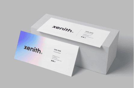
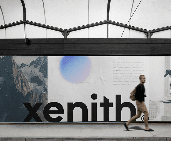
A brand identity and website for Xenith, a new UK accounting firm whose existing presence felt rigid and outdated. The rebrand paired bold electric blues with soft peach tones and a no-fluff typographic voice, aiming for a site that read as confident and approachable rather than corporate.
The problem
Xenith was a new firm with real expertise, but the old site felt rigid and outdated: it undersold what they were good at. They needed a brand and online presence that felt confident but approachable, showing professionalism without tipping into corporate stiffness, in a category (accounting and financial services) where most competitors default to one or the other.
The goal
Create a friendly yet professional brand, and a website that delivers clarity and trust while making complex services easy to understand and access.

Journey map

Wireframes
Wireframes let me test structure early, before high-fidelity mockups brought in the visual identity, focused on clarity, trust, and confidence. The experience was refined through feedback loops to keep it focused and user-led throughout.
Key decisions
Grounded the visual identity in a UX process, not just a mood board
Before any brand execution, the team ran stakeholder interviews and competitor research to define clear user flows, tested structure early with wireframes, then brought in the visual identity through high-fidelity mockups, refining through feedback loops so the finished brand stayed focused on clarity, trust, and confidence rather than decoration.
Shaped the wordmark around the name's meaning, not a separate symbol
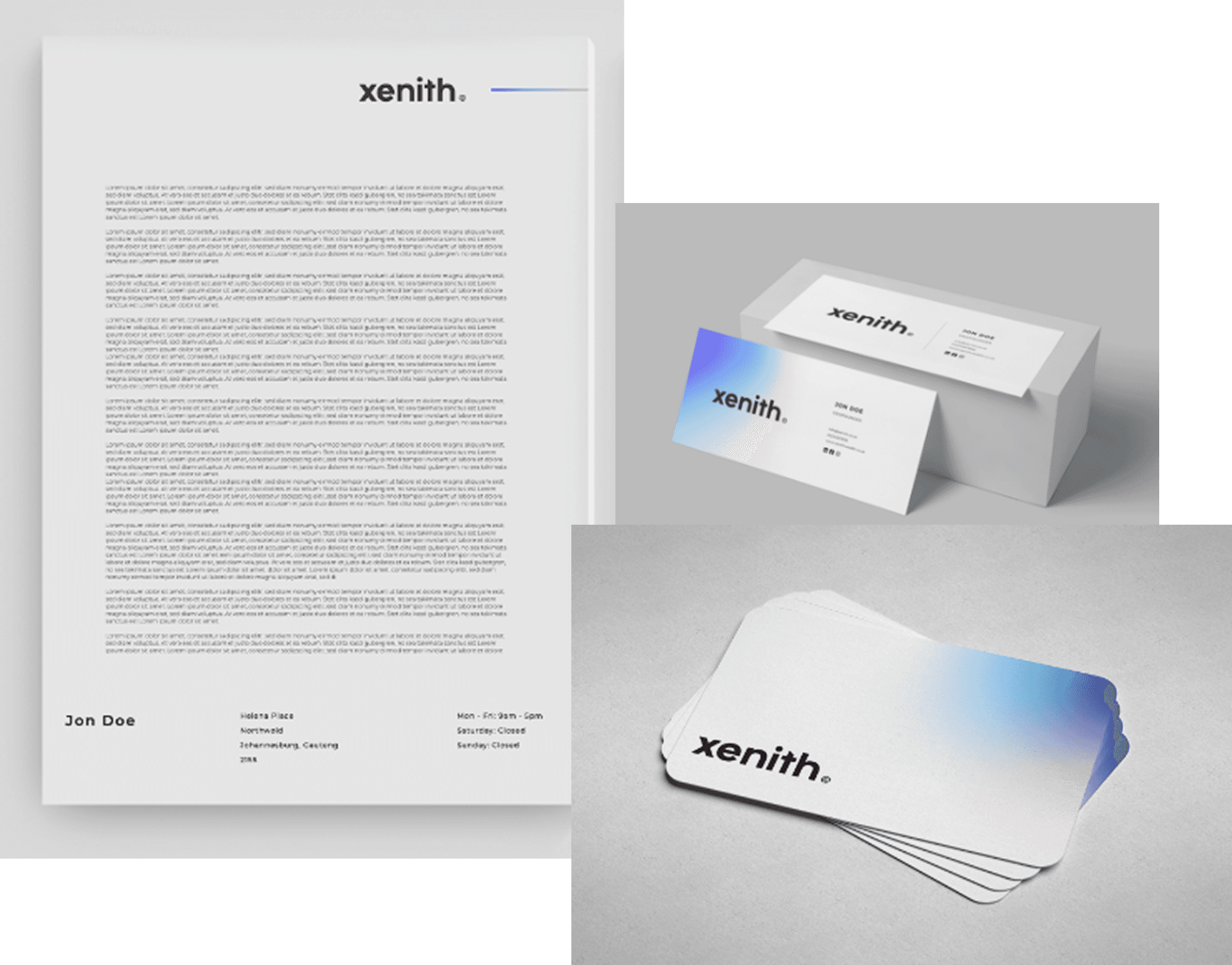
Xenith refers to the highest point, so the logo exploration focused on leading lines and vertical movement before landing on the tallest letter in the wordmark: a slight manipulation of the 'T' into a soft point. That gave the identity a conceptual anchor without bolting on a separate icon.

Treated motion as part of the brand feel, not a finishing touch
The site was hand-built in Webflow with custom animations and micro-interactions, but every scroll, hover, and transition was considered deliberately: enough motion to support the brand feel, not enough to distract from a site whose job was to make complex financial services feel simple.
Style guide
Bold electric blues paired with soft peach tones, balancing professionalism with warmth.
Clean and modern, supporting a no-fluff tone of voice that makes complex financial services feel simple.
Where it landed
Fully replaced Xenith's previous site. The team runs their business on it today.
What I learned
Designing for a financial services brand meant learning to simplify complex information without losing credibility, and how much visual language alone can shape trust before a word is read.
Close collaboration with the Xenith team (clear feedback cycles, shared ownership of ideas) kept the brand and the build aligned from strategy through to shipped site, instead of drifting apart the way brand guidelines and real screens often do.
The project was a reminder that thoughtful design paired with precise execution can shift how an entire brand is perceived online, not just how one page looks.