CellMed
A mobile and desktop app for CellMed, a medical aid provider, giving members one place to check their digital membership card, medical savings balance, claims, contributions and benefits.
Sole UX/UI designer on CellMed, working directly from the client's functional specification through to flows, requirements and the design system, with no separate research or product function on the account.
The problem
CellMed's brief was a functional specification, not a design: a line-item list of data fields for claims, membership, finance and benefits, illustrated with the client's own placeholder sketches rather than real UI direction. The document said as much itself, noting it was still to be refined to add the client's UX/UI. Underneath the field lists sat a genuinely complicated product. A single claim carries three different figures (amount claimed, amount awarded, amount payable) plus a disbursement type that decides whether the payout goes to the member or the provider. Contributions and banking details run in two currencies, USD and ZiG. And every one of these views had to work as both a mobile app and a desktop experience from one system, not two separate builds, which was an explicit requirement from day one.
The goal
One coherent member experience, on mobile and desktop, that turns a spec written as data fields into flows a member can actually follow: what's in my medical savings account, what happened to my last claim, what am I covered for, and what do I still owe.
User research
With no existing UI or prior research to build on, the functional spec itself was the primary source. I worked through it service area by service area, claims, membership, finance and benefits, mapping the flow behind every field list before any screen design started, and translated what that surfaced into the structured product requirements the rest of the design works from.
Component library
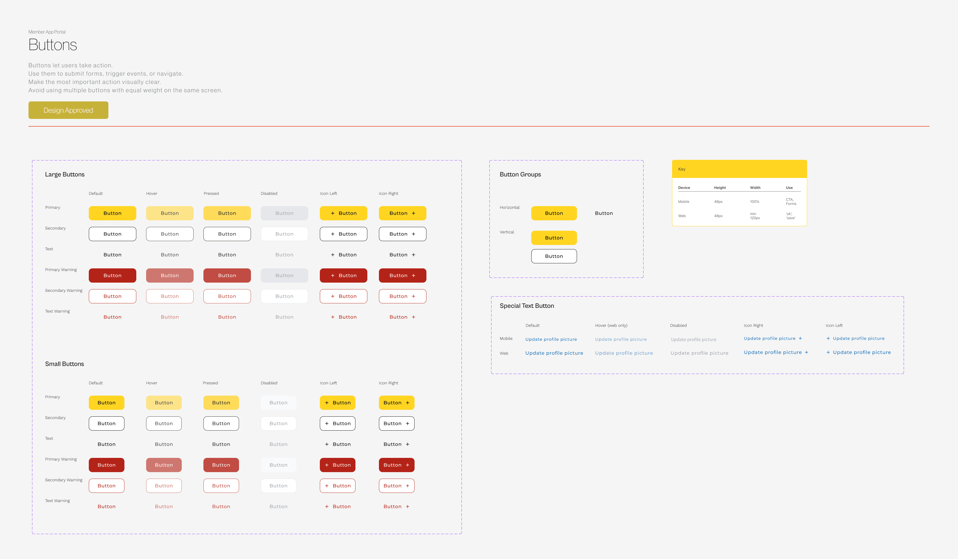
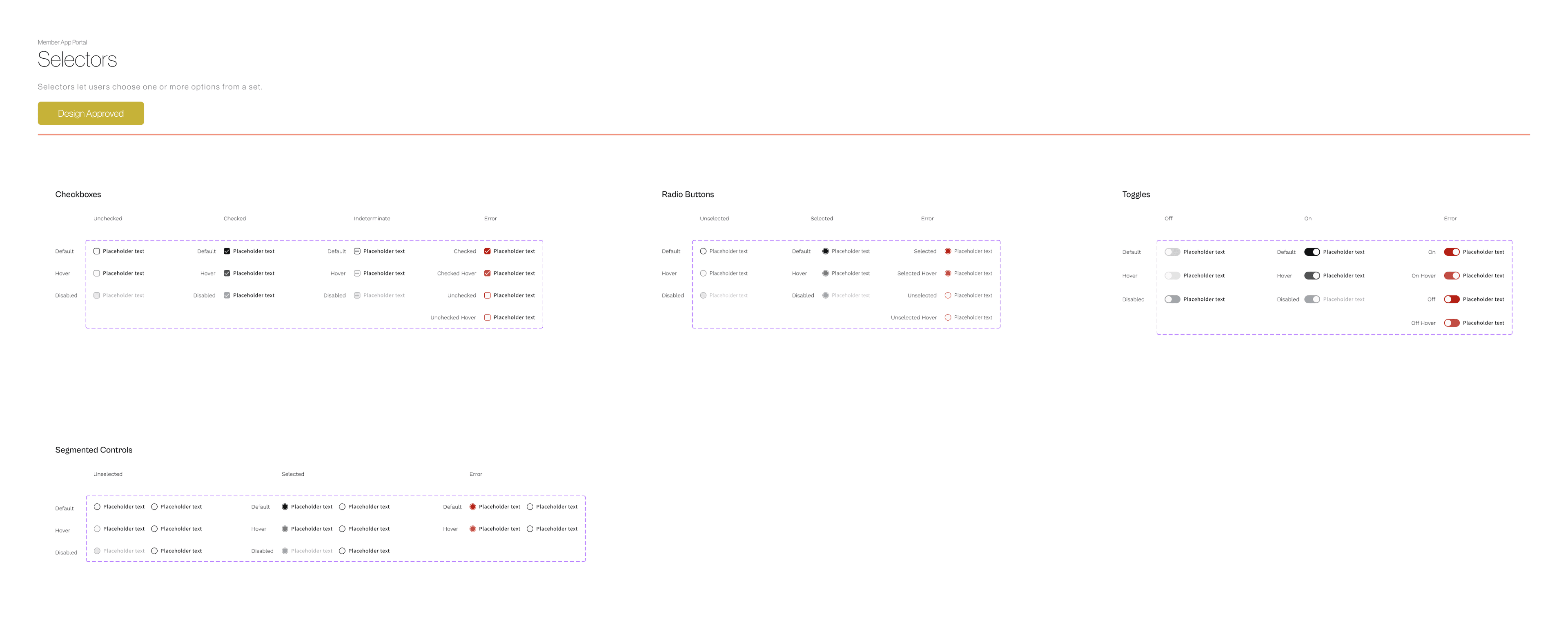
The system is device-aware from the token level up: the button spec sets mobile at 48px tall and full width, for CTAs and forms, and web at the same 48px height but a 120px minimum width, for actions like confirm and save, so the two surfaces share a component without sharing a size. The library itself is complete — alerts, modals, navigation, tags and more, alongside buttons and selectors — and what follows is a snapshot of two of those sets: buttons (primary, secondary, text and warning variants, every state) and selectors (checkboxes, radio buttons, toggles, segmented controls).
Key decisions
Turned a field list into flows, not screens
The spec described what data each screen needed to show, not what a member does with it. Before any UI, I mapped a flow for every service area, so a requirement like "view specific claim details" became an actual path: search or filter, open a claim, see why the awarded amount differs from what was claimed, see who it was paid to. Those flows became the product requirements the rest of the system was designed against.
Designed one system for two surfaces, not two products
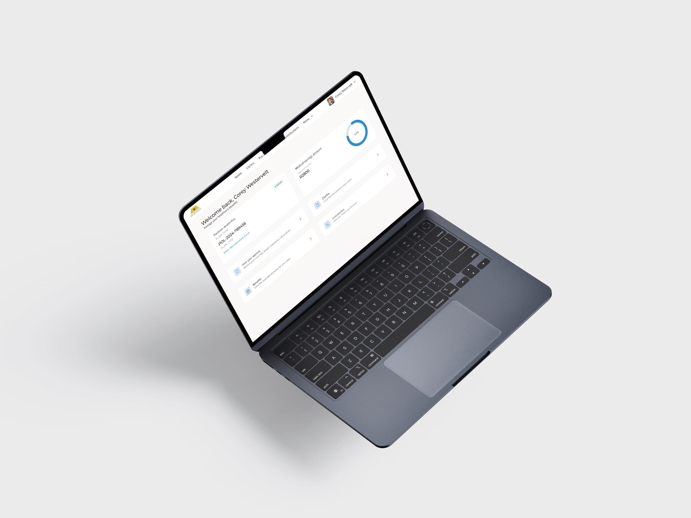
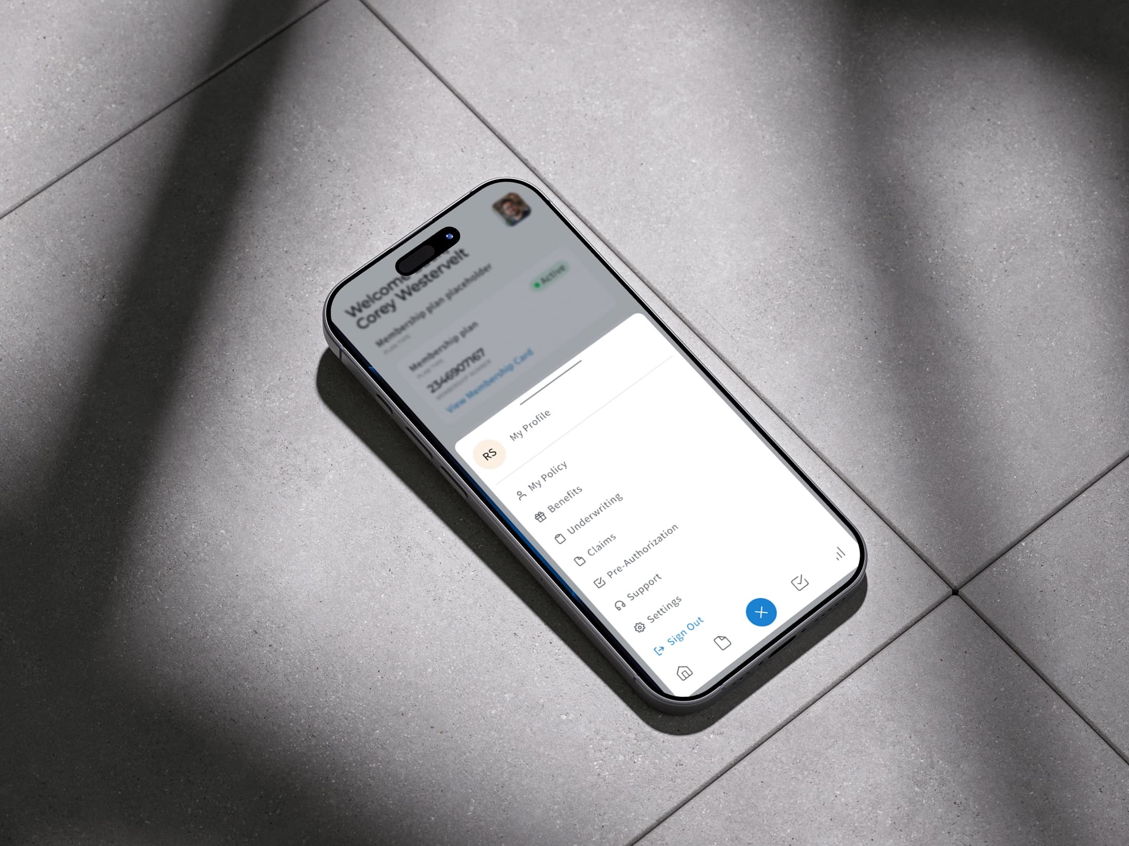
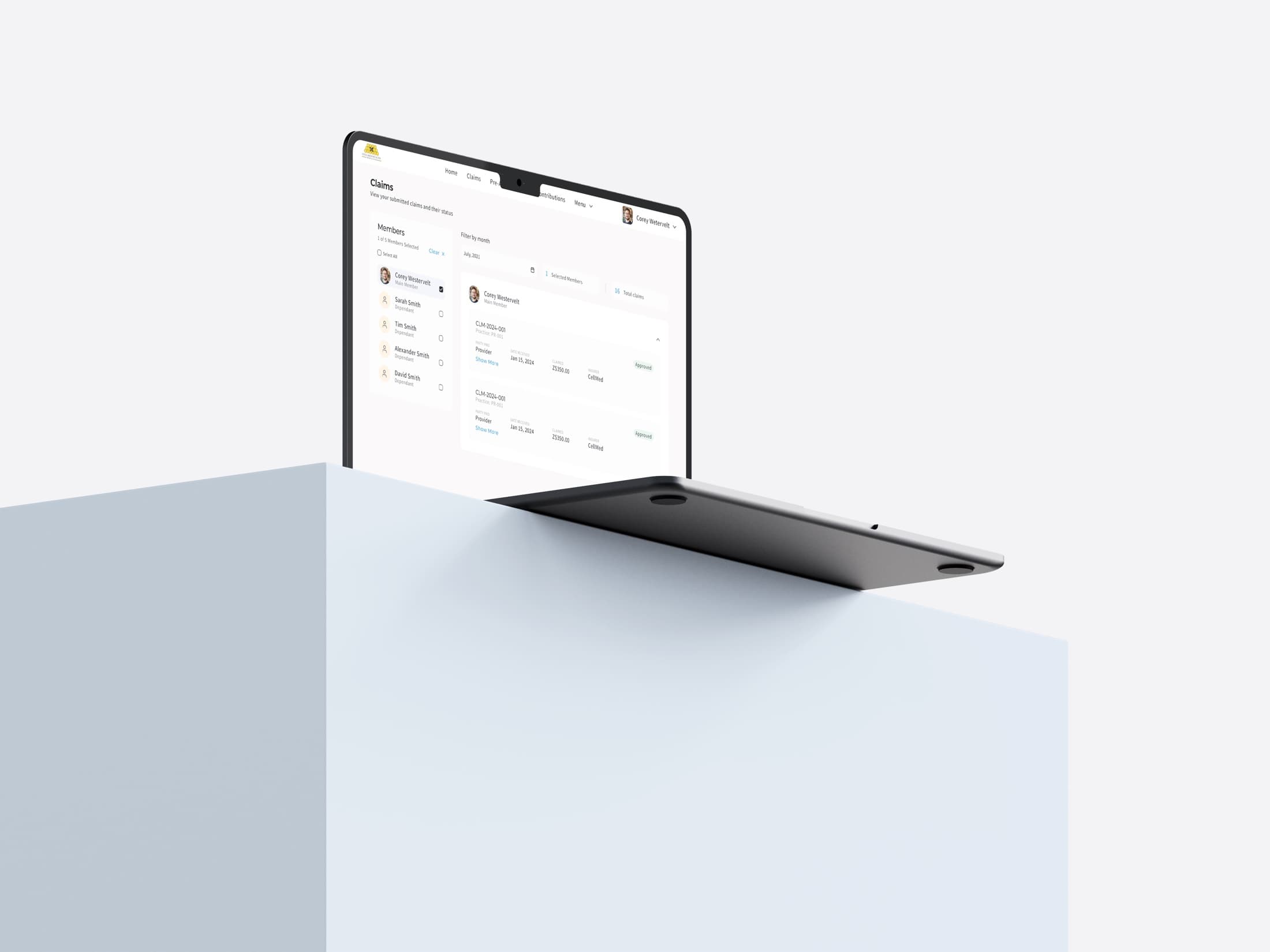
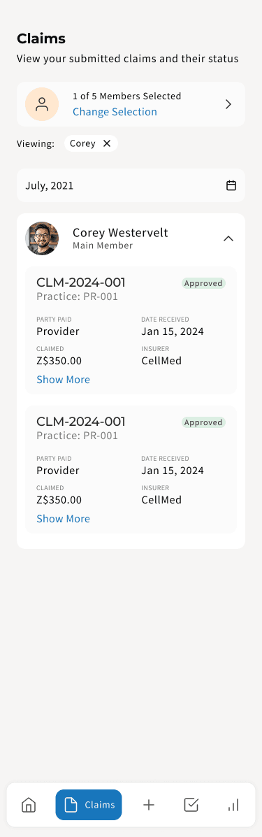
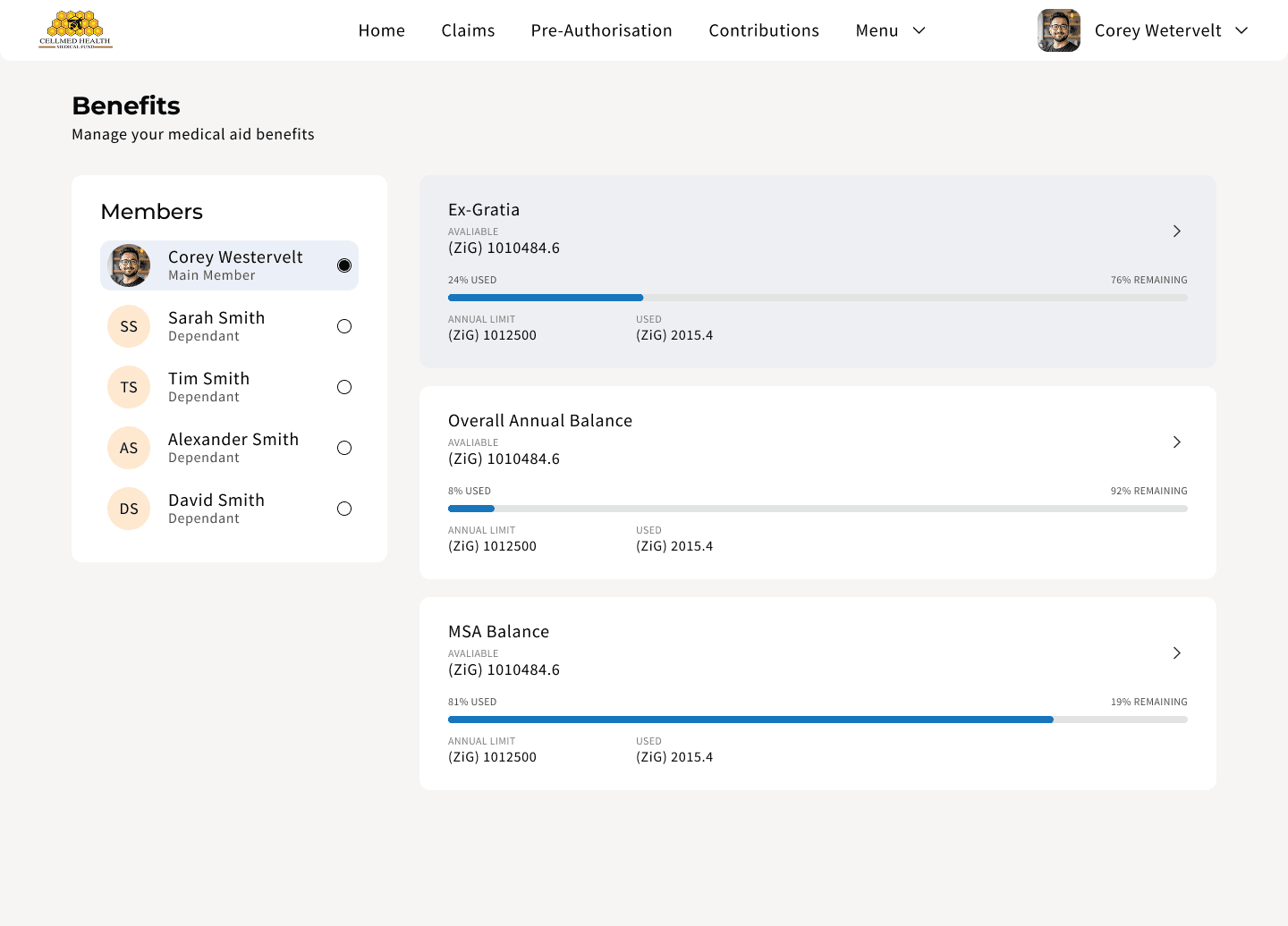
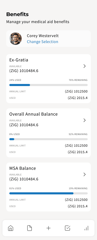
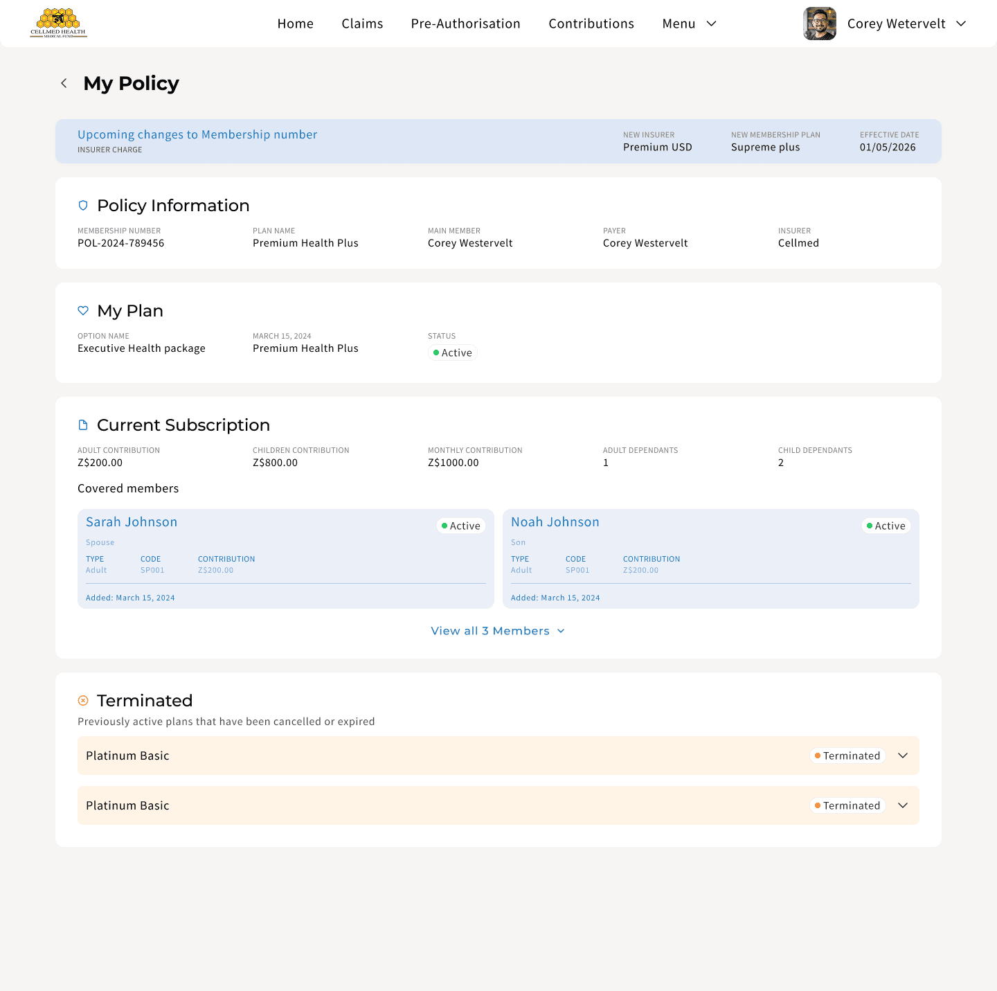
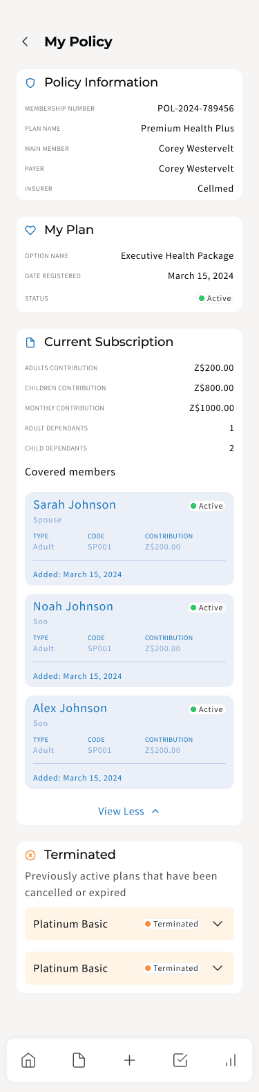
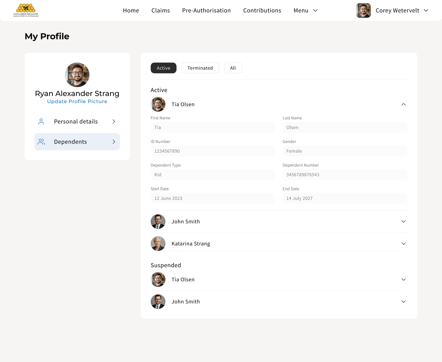
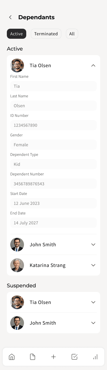
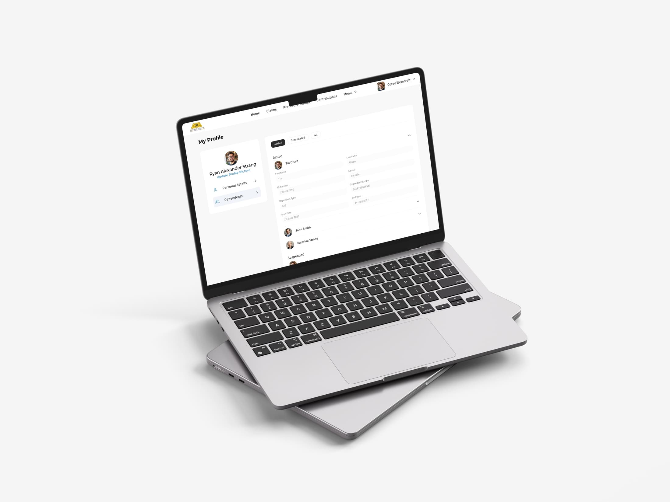
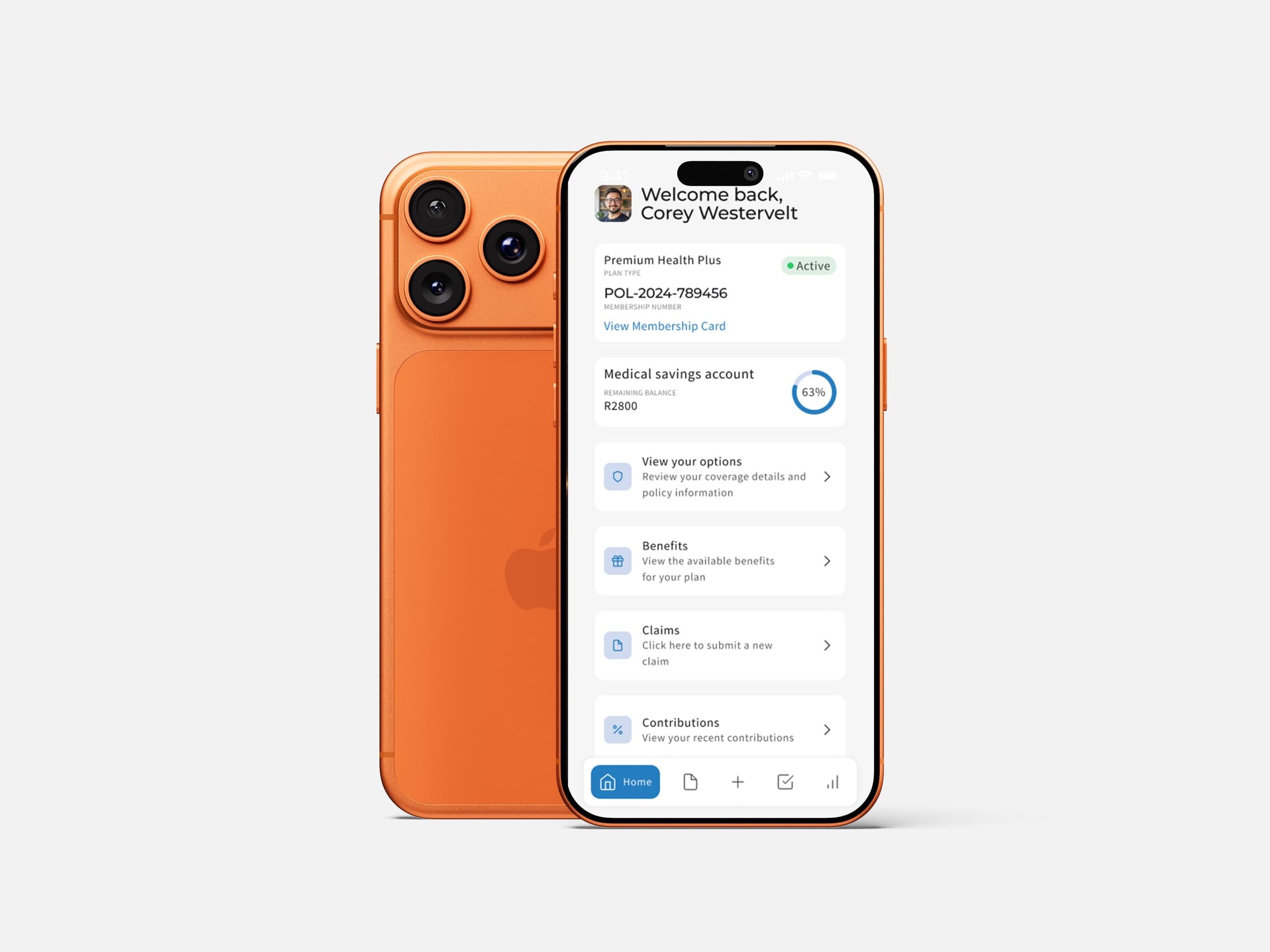
Mobile and desktop were both explicit requirements from day one, for a member base that moves between checking a claim on their phone and doing an annual benefits review at a desk. Rather than a mobile app with a desktop version bolted on after, the component system was built to hold both from the start, so a claims list or a benefits breakdown reads correctly at either size.
Made a claim's money story legible
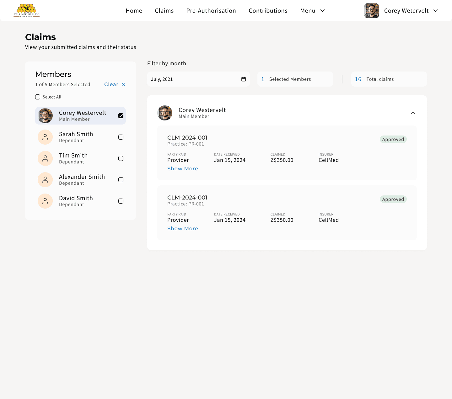
A single claim line carries three figures, amount claimed, amount awarded and amount payable, plus whether the payout went to the member or their provider. Left as a data table, that is four numbers a member has to reconcile themselves. The claims flows were designed around making that story readable at a glance, not just available on request.
Built the finance view around two currencies
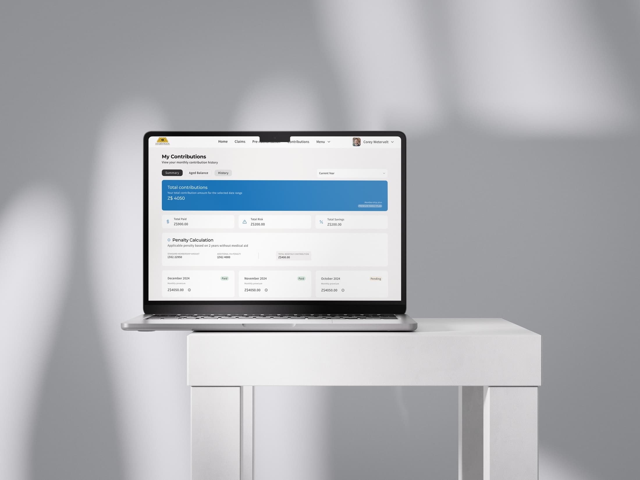
Members' contributions and banking details run in both USD and ZiG, so the finance and contributions views had to hold two currencies clearly side by side, rather than defaulting to one and burying the other.
Desktop & mobile
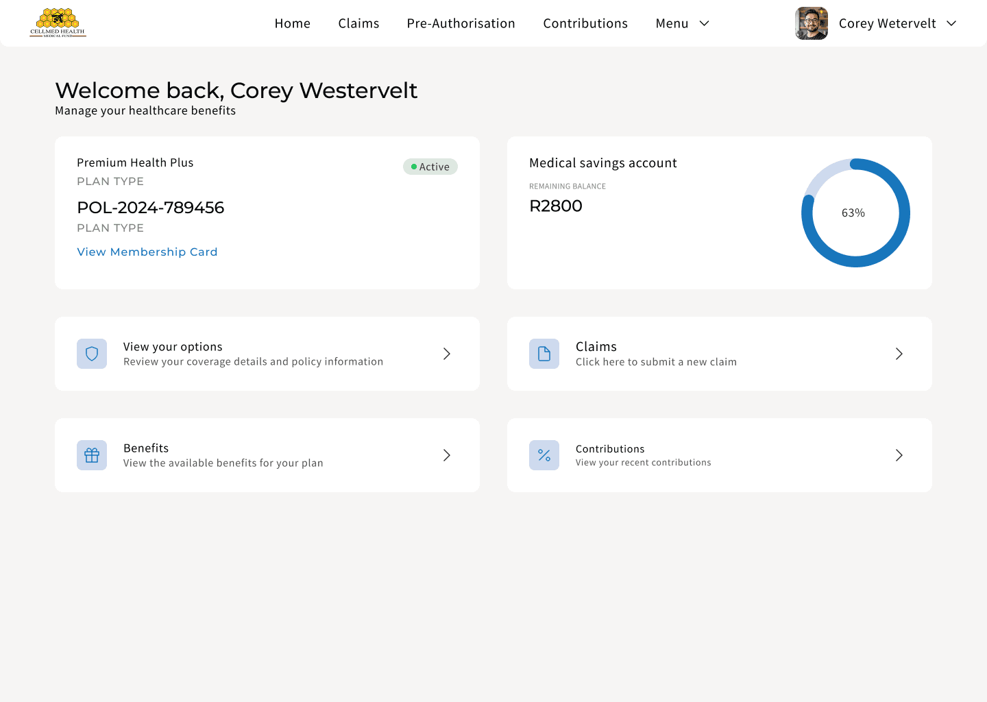
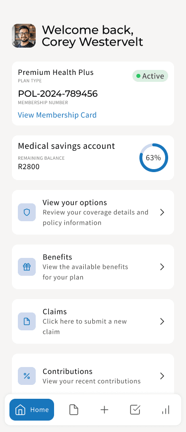
Five flows shown as built, on both surfaces: the same screen, the same data, sized for where a member actually is.
What I learned
A functional spec is not a design brief. A field list tells you what data exists; it does not tell you what a member is trying to do when they open the app. Mapping the flows first, before any screen, is what turned a document that was "not too helpful" on its own into something designable.
Building for two surfaces from day one is cheaper than retrofitting later. Deciding early that mobile and desktop would share one component system, rather than designing mobile and bolting on desktop, kept the two from drifting apart as the requirements grew.
Financial data needs a translator, not just a table. Claimed, awarded, payable and disbursement type are four real numbers a member has to reconcile; the job was making that reconciliation obvious rather than technically available.
Being the sole point of contact meant every question went straight to the client and every answer came back the same way, no relay through a PM or a research team. The lesson for next time is to use that directness earlier: put clickable flows in front of the client before the spec's interpretation hardens into requirements, not after.
What’s next
Usability testing with real members, particularly around the claims and benefits flows.
Push notifications for claims updates and payment reminders, and downloadable claims and contribution statements — both flagged in the original brief.
Digital wallet and payment gateway integration for contributions, the other item the brief left for later.